
èqui
service design / communication design
2022
People with a migratory background often face challenges when they move to a new country. Cultural differences and language barriers make it difficult for them to fully participate in society. Despite these challenges, people with a migratory background can bring valuable skills and experiences to their new communities.
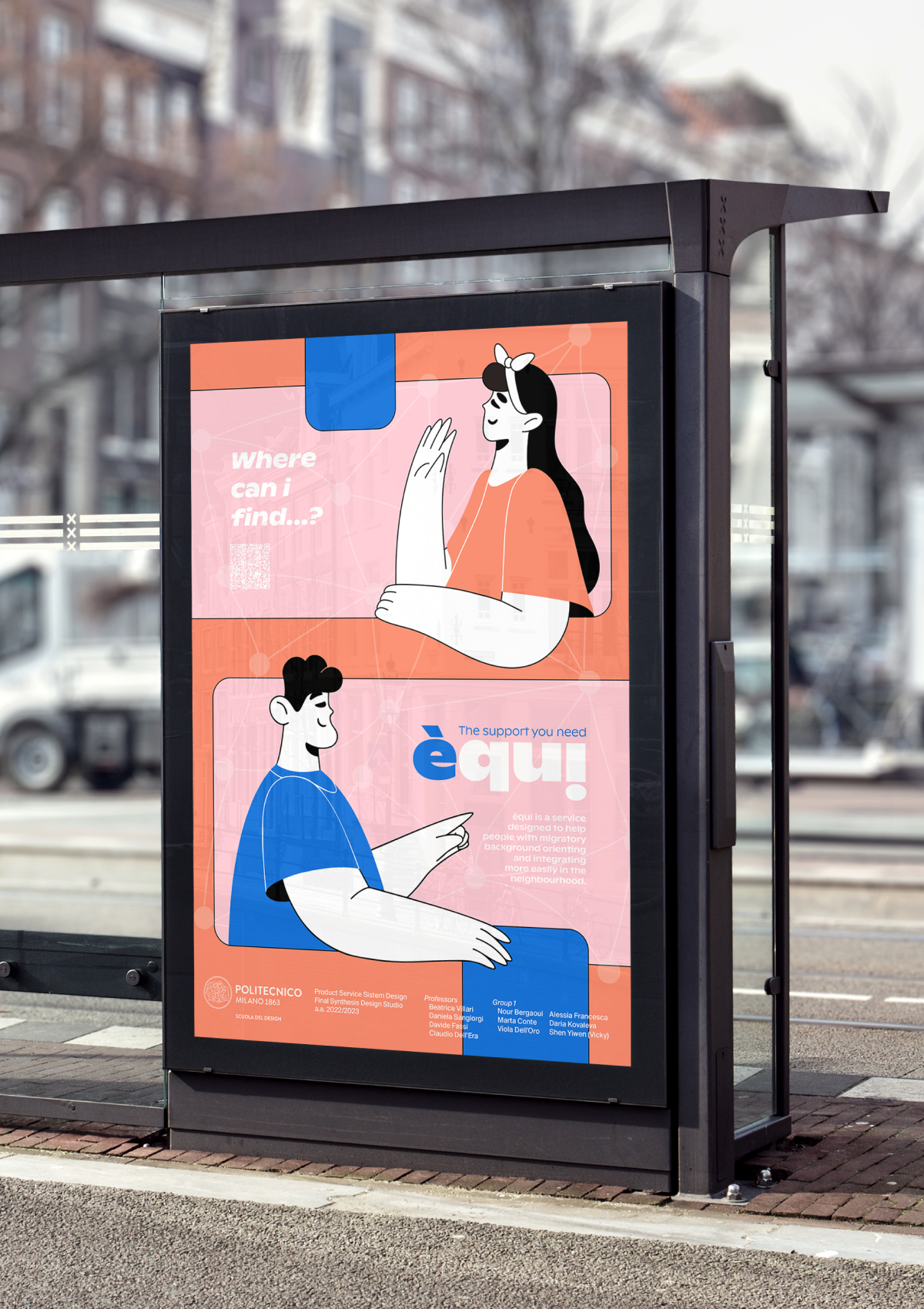
èqui is a network of organisations and volunteers aiming at providing support to people with a migratory background accessing and navigating the net of services in Municipio 2 in Milan. Our service aims to overcome language barriers and cultural differences to help people with a migratory background better access and interact with local resources, by supporting them in the new environment and creating a more inclusive and equitable community.
èqui is a student project made by a team in 6 at Politecnico di Milano. I was mainly involved in the research, communication and web design process.
èqui is a student project made by a team in 6 at Politecnico di Milano. I was mainly involved in the research, communication and web design process.
See booklet
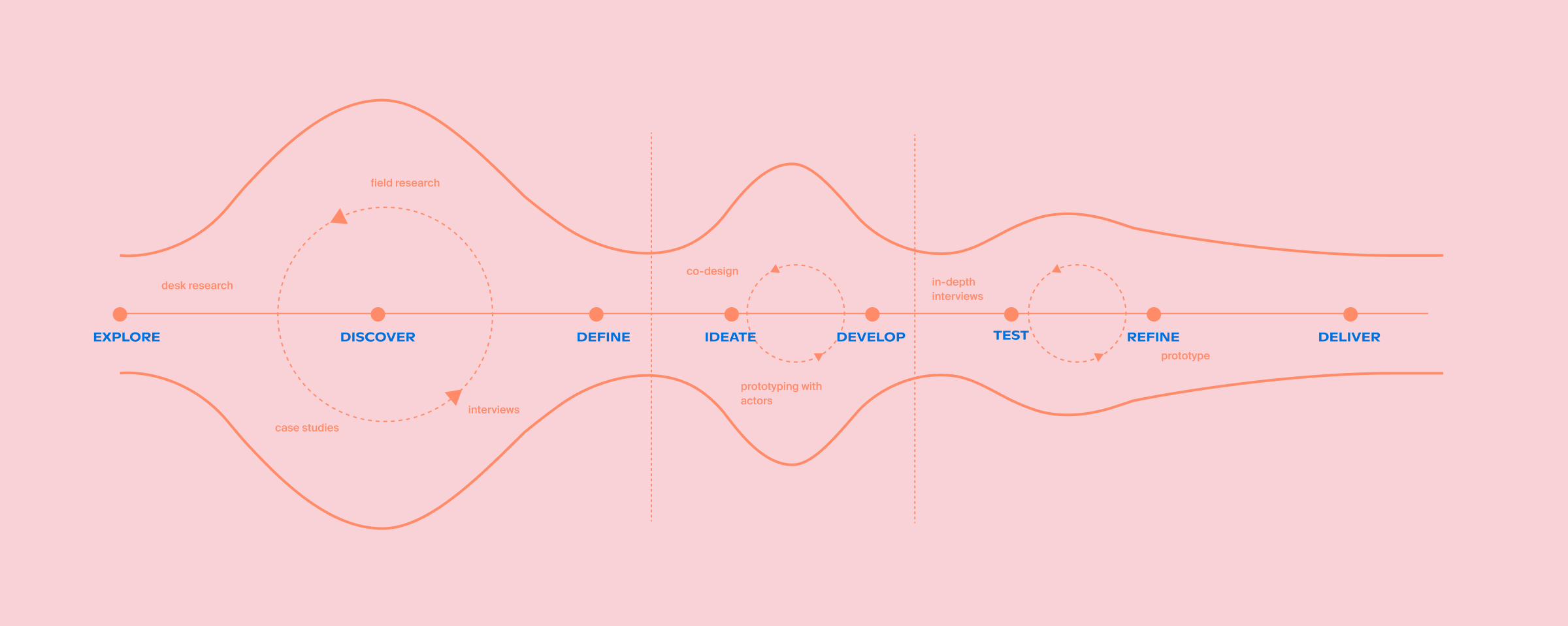
Our process for this project was an iterative process mainly consisting of three macro phases: scope definition, service development and service delivery. Referencing the human centered design process by IDEO (2019), our process was alternating between converging and diverging, zooming in and zooming out, in order to tackle our topic from different angles and perspectives.
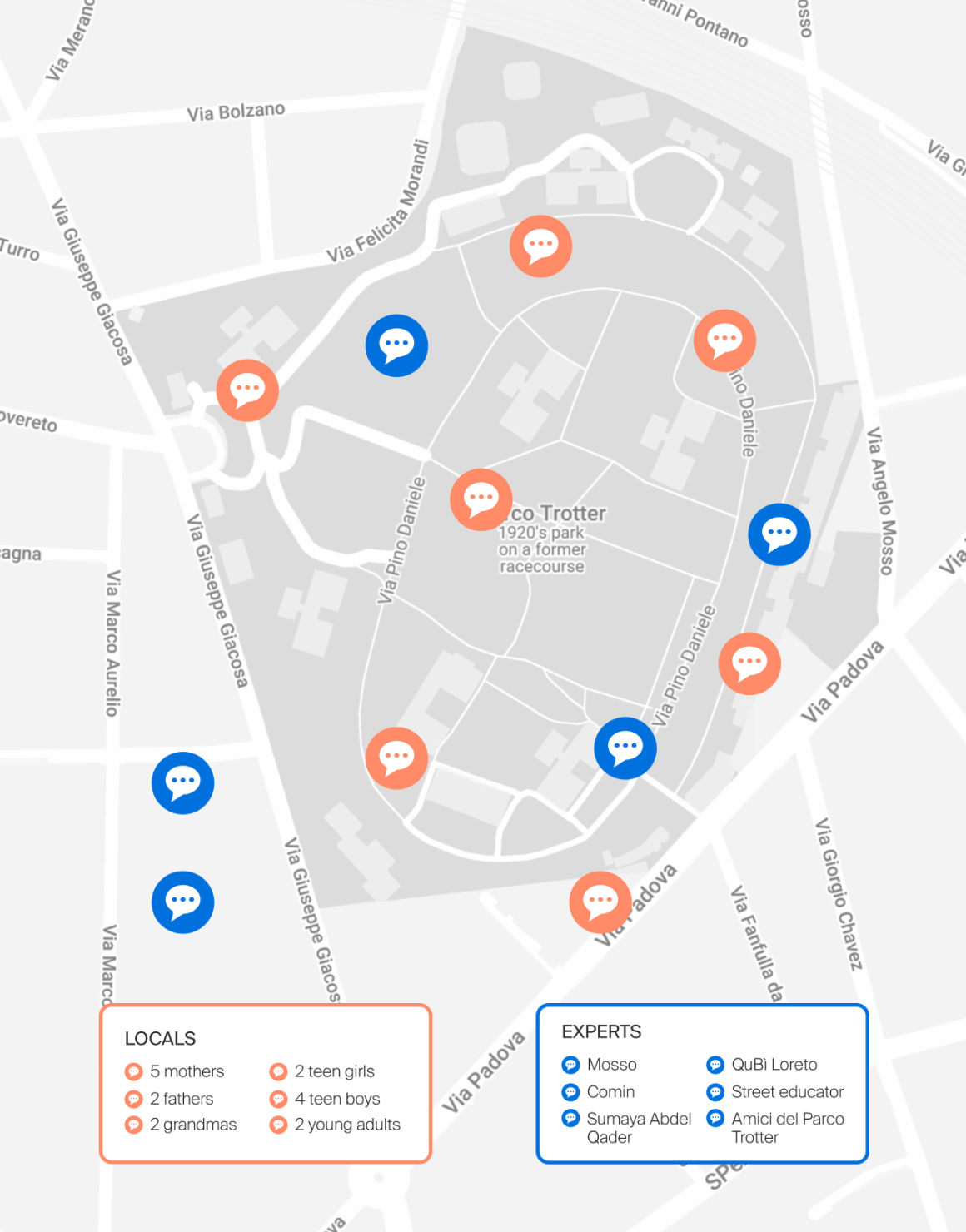
The scope of our research was delimited by two main streets in Municipio 2; Via Padova and Viale Monza. These streets represent a melting pot in the city of Milan, with similar yet very distinguished realities.
Throughout our field research, we interviewed local people and experts from associations. Conducting interviews with these individuals allowed us to gain valuable insights into how organizations train and manage volunteers, as well as the specific needs and challenges people face.
Throughout our field research, we interviewed local people and experts from associations. Conducting interviews with these individuals allowed us to gain valuable insights into how organizations train and manage volunteers, as well as the specific needs and challenges people face.
We designed the co-design session to verify our primary assumption: if people with migratory backgrounds miss a bridge between themselves and society. Moreover, we wanted to discover and identify our target's main problems and difficulties they could have and need support with.
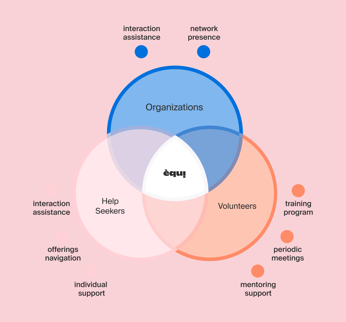
èqui provides people with a migratory background and the associations that work for/with them with a network that brings together all the services available in the area. Moreover, through the interaction of our trained volunteers with help seekers, it makes it possible to monitor the most frequent needs and requests, so that the gaps can be identified and addressed by local associations and organisations.
Offering map
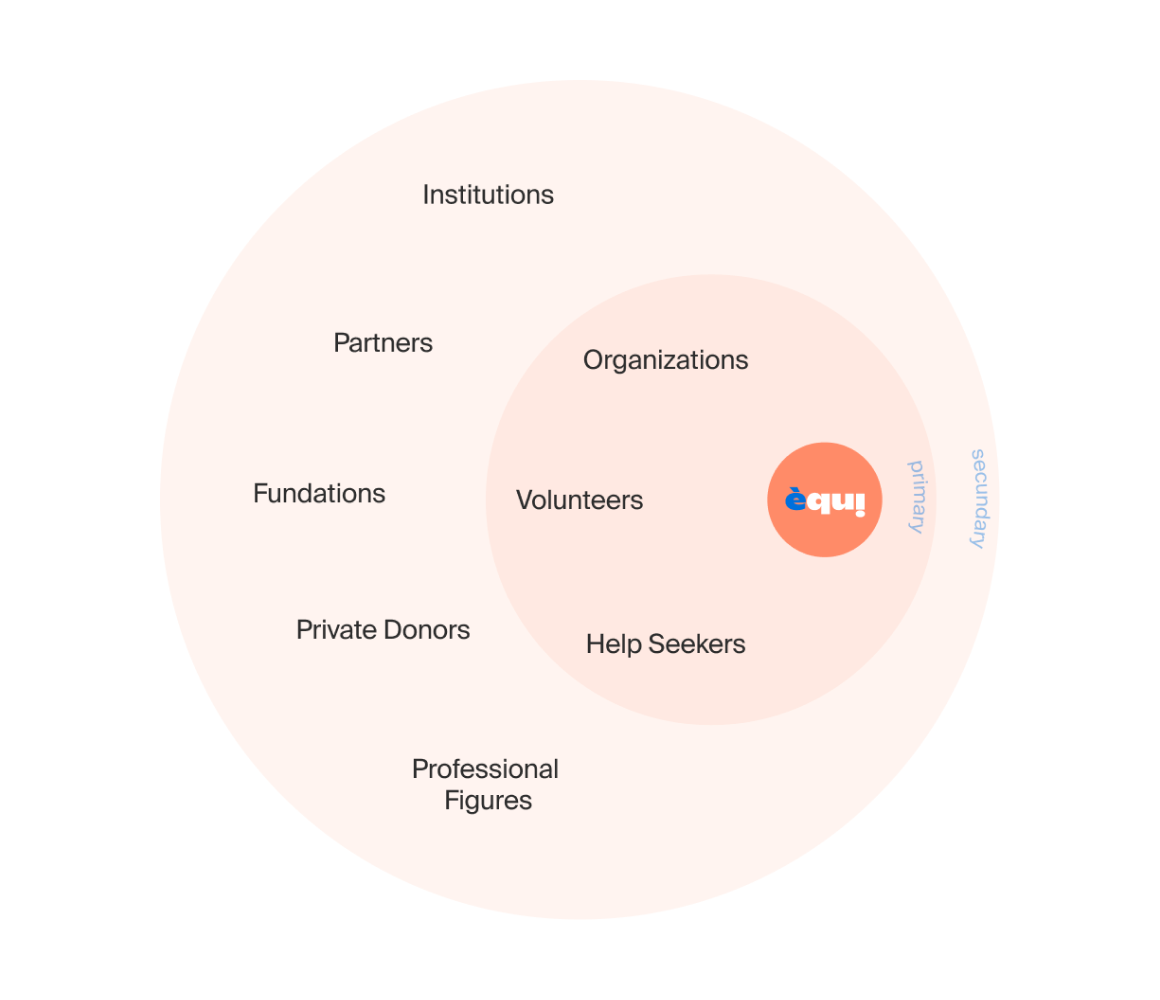
Stakeholders

Stakeholder interactions
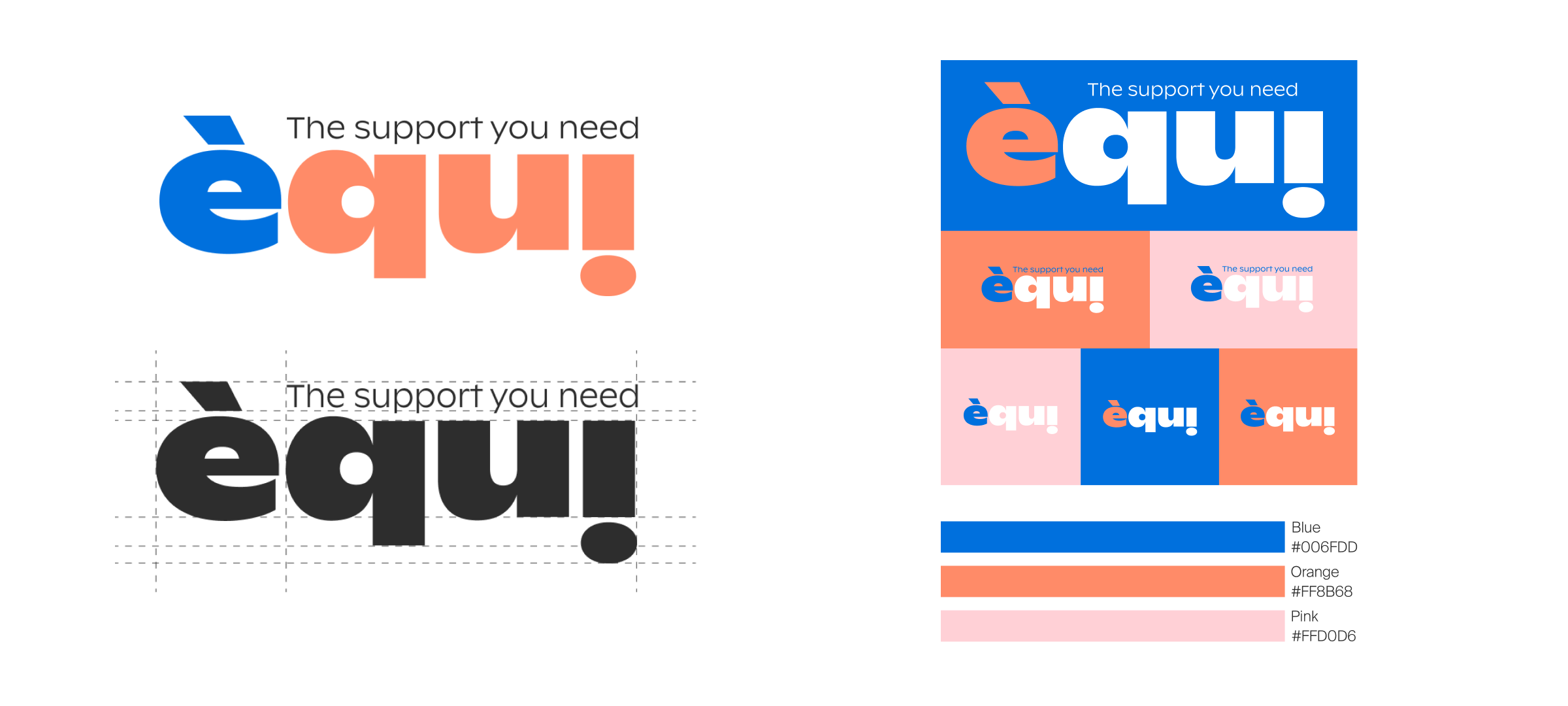
Our brand identity is based on two fonts: Ginto Nord and Suisse Intl. The colour blue is a symbol of reliability, productivity, stability, while orange is generally considered a colour that expresses enthusiasm, harmony, and peace of the senses, all characteristics we want to convey to people through our service. Finally, the pale pink is used as an accent colour, mainly for details.


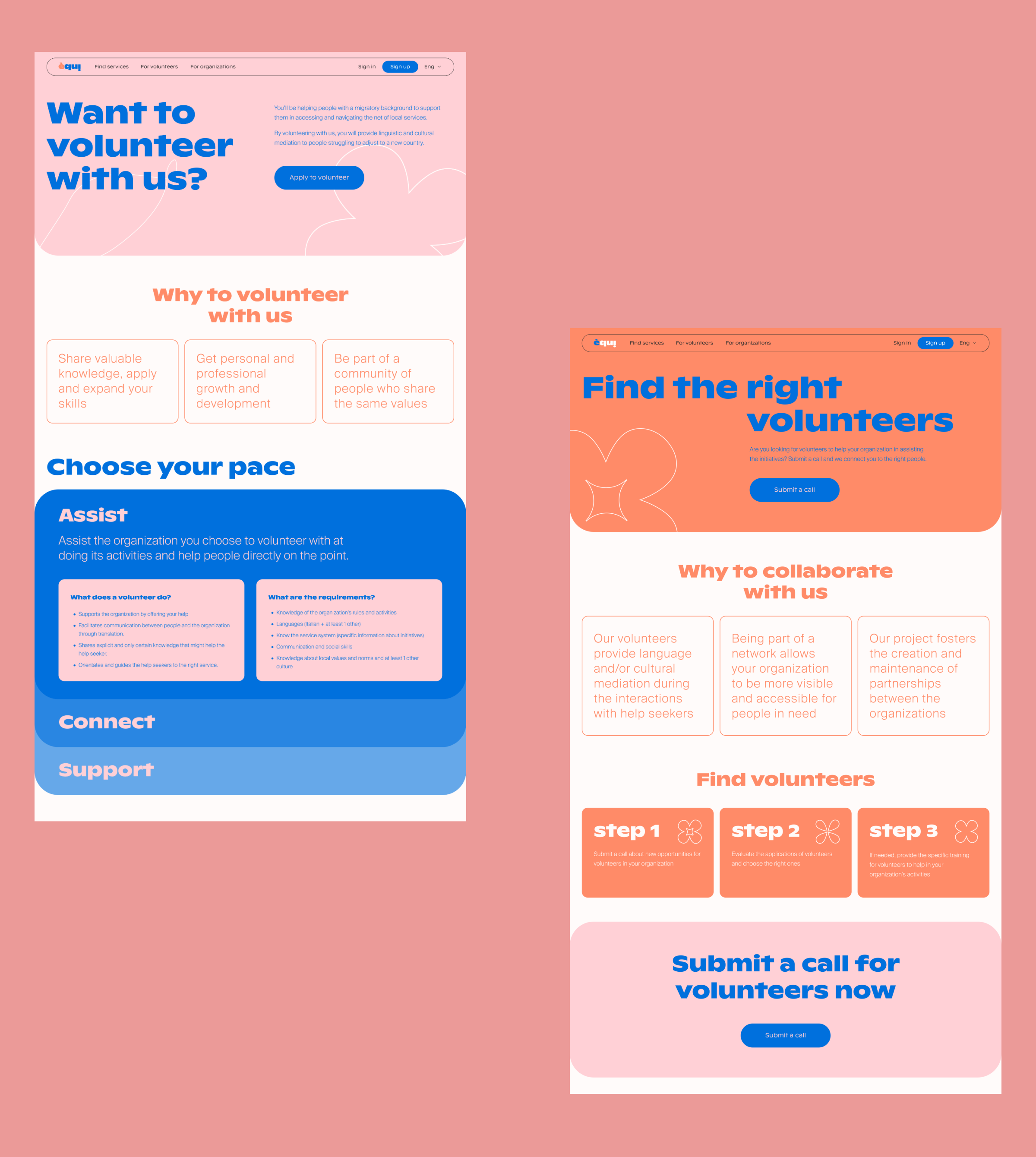
The website is designed in such a way that users can quickly access the map and search for local services that meet their needs, as well as suggest new services to add to the map. In addition, the èqui platform serves as a way to connect our main target groups — volunteers can be matched with a person in need and/or an organisation where the volunteer work is needed.
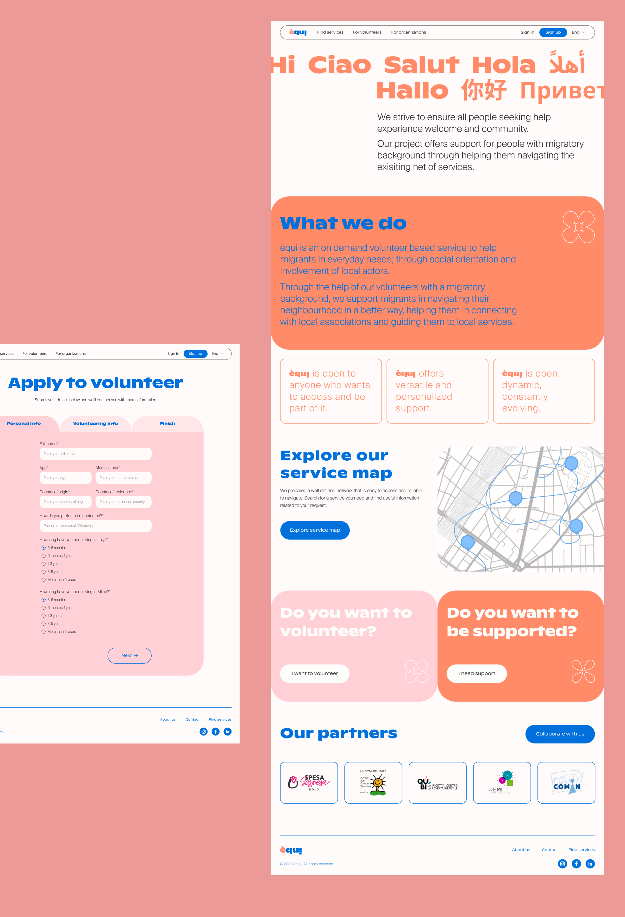
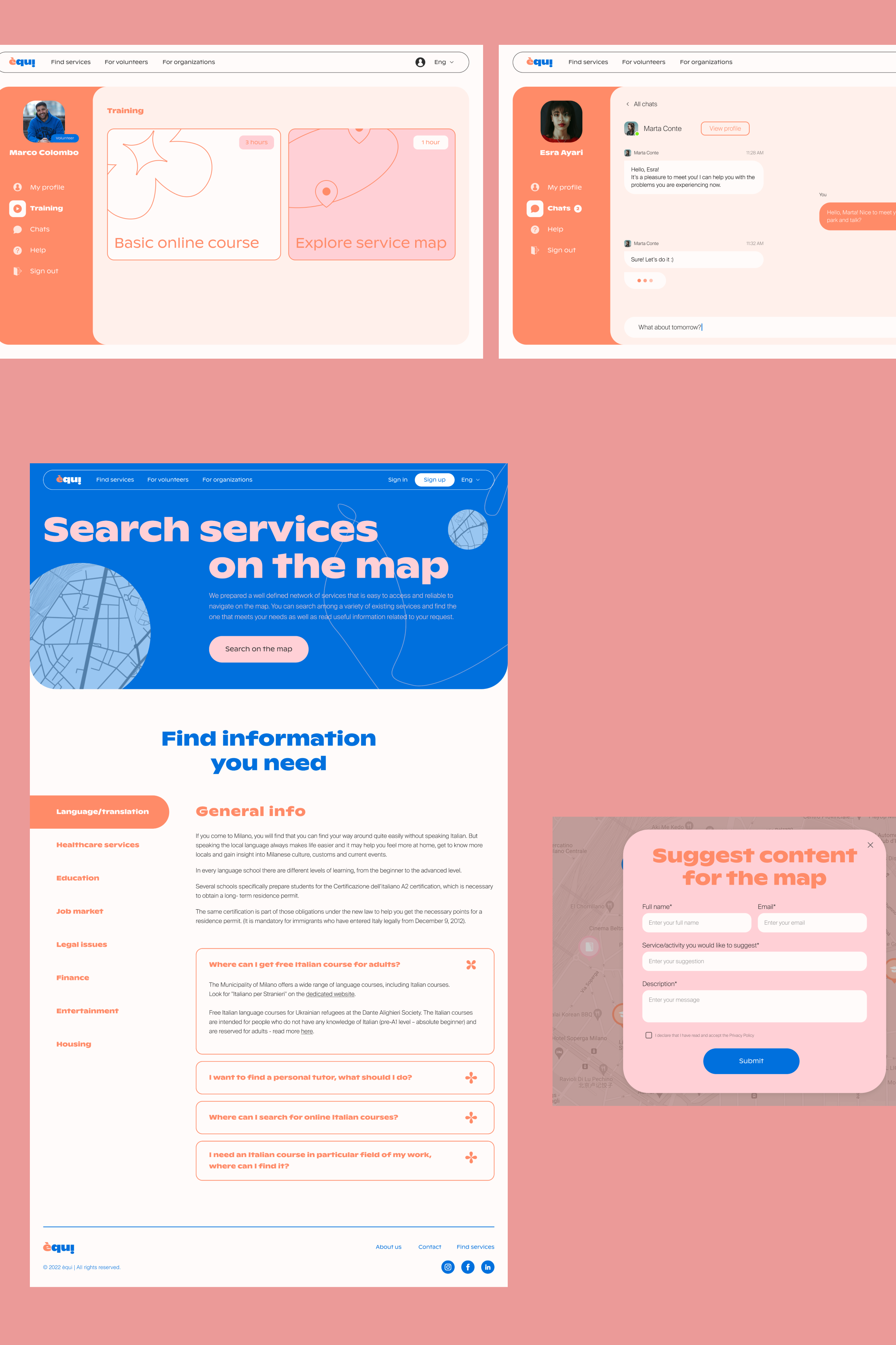
Our goal was to make the website useful and relevant to the needs of all groups, and to use clear, friendly, and easy-to-read content to help convey information and make the website more engaging and visually appealing.
We are grateful this project gave us the opportunity to learn more about associations and initiatives that benefit the local community of people, talk to people with different backgrounds, and participate in activities that gave us valuable experience and insights.
We strongly believe that there is great potential in this area for the implementation of our service, and our long-term goal is to make the network of services visible and accessible to everyone in need.